Supporting an environmentally sustainable and socially just society.
reen America focuses on strengthening the environment and promoting social justice with a sustainable economic model through consumers, investors, businesses, and the marketplace. WDG partnered with Green America to give the national not-for-profit membership organization a powerful digital platform for influencing global economic and environmental change.
Project Mission
Green America sought a redesigned aesthetic with a streamlined site structure to target specific audiences. They also required a new sight structure to increase activism and funding for their multidisciplinary causes.What We Did
WDG partnered with Green America to create a cohesive information architecture and targeted design for increased donations and support from users. We created a balanced design to clearly and cohesively convey Green America's wide body of content and garner increased support for their causes.A Streamlined Site Structure
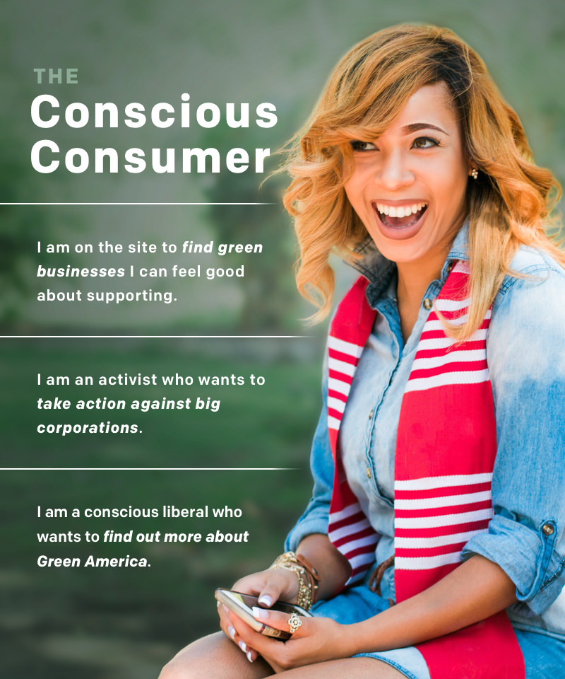
WDG strategists began by establishing proto-personas for Green America’s target audiences, finding four new audiences in addition to established activists and those interested in green living. The new audiences included donors, business leaders, green entrepreneurs, and investors, meaning the information architecture needed to be targeted towards increasing funding. We clarified the site organization to help users find key information more easily, reducing 1,400 pages to 500 for the new site. WDG’s team added key landing pages and attractive new donation pages, created a more cohesive site structure, and increased opportunities for social media and marketing engagement.
A Balanced Design
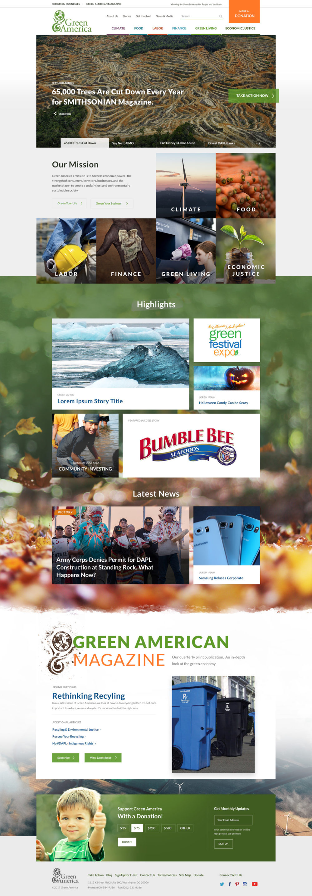
With a robust catalogue of content and wide variety of projects, creating a balanced design for Green America’s site redesign was imperative. Our designers created a balanced aesthetic by invoking natural imagery, bright accent colors, and brushstroke-style headers. The overall design combines an earthy, organic tone to accomplish a striking visual aesthetic.
Increasing User Engagement
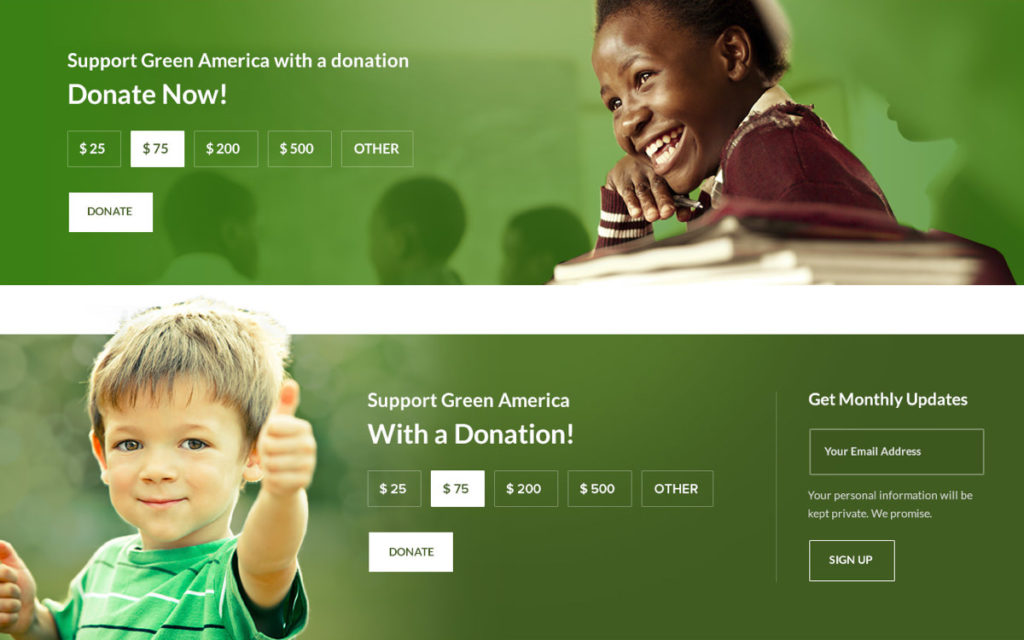
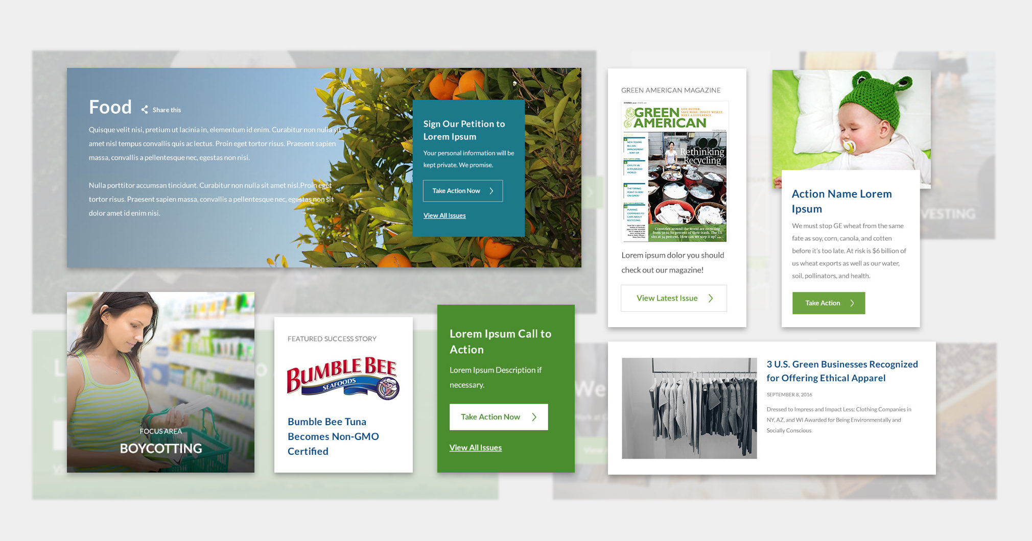
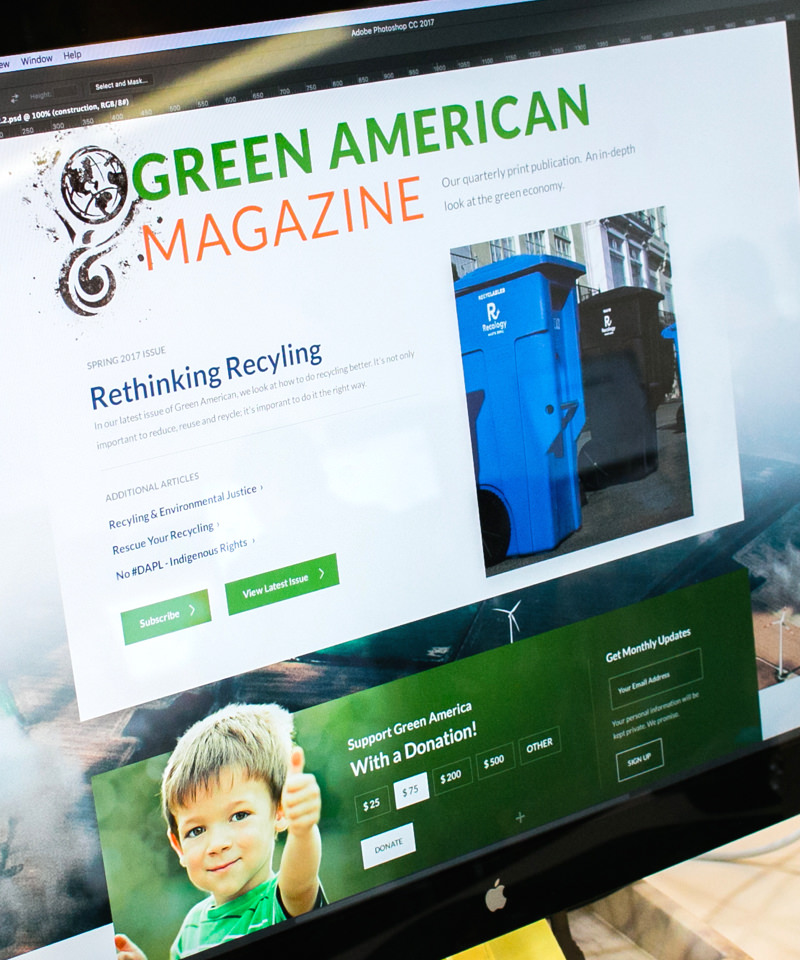
In redesigning the site structure, increased engagement from donors and users became a distinct priority. Specific pages were designed with prominent calls to action to encourage conversions, whether action or donation-focused. Another particular goal of the site included increasing email subscriptions and social engagement as a means of improving inbound marketing. We therefore added specific layouts with featured callouts for email subscriptions and for one of the organization’s major publications, Green Living Magazine. We also created a featured section within the site structure to highlight the publication, and included multiple iterations of magazine layouts in the kitchen sink to create a wide variety of choices for Green America administrators.
Incorporating Revenue Opportunities
Because Green America is a nonprofit that actively depends on the support of donors to foster green-living practices, our design created areas for authentic product and sponsorship placement. These included an organized grid for featured partners and specific “Victories” section to encourage continued support of their various causes. The integration of Green America’s multiplicity of channels and platforms required careful organization, including daughter sites, blogs, social integration, publications, and applications. By integrating these channels, we were able to ensure broader reach of materials and information for target audiences, whether for casual users or high level donors.
