Top 6 Reasons to Refresh Your Nonprofit Website

If eyes are the window to the soul, your website is the window to your organization’s soul.
A modern, easy-to-use, professionally designed website is not only beautiful to look at, but it helps you open the door to a bigger, more active, and more engaged audience.
For a non-profit organization, a more engaged audience helps you gain more awareness, raise more funds, and reach your goals.
If your nonprofit is considering a rebuild or a redesign, here’s what you need to know
1. Modern Sites Are Expected
If your site is looking dated, old fashioned or behind the times, potential donors and supporters may not trust that your organization is best-in-class at delivering the services of their mission.
They might look elsewhere for a site that earns their trust.
A modern site should have an easy-to-use interface with attractive design elements to appeal to the reader.
For an example of how to use design and imagery to your advantage, look at the National Fish and Wildlife Foundation website. They have a beautiful mission and needed a website that did it justice. WDG collaborated with their team to redesign the NFWF site with a sleek, beautiful interface that showcases the visually-striking nature photography they had at their disposal.
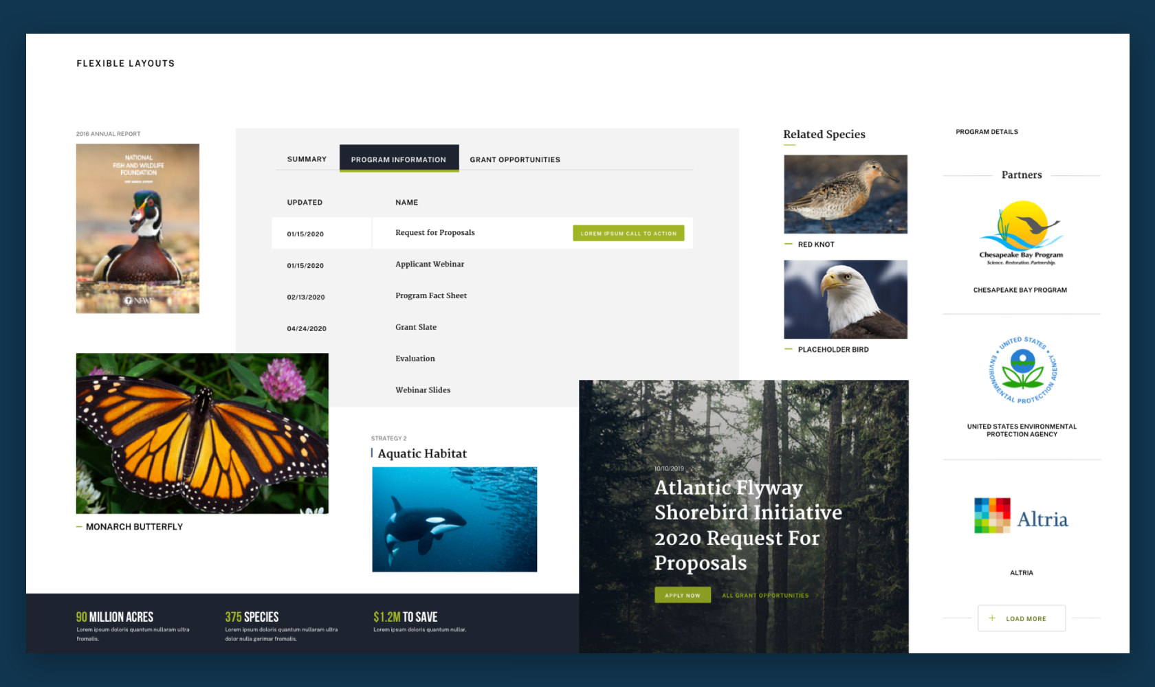
The use of color, layout and imagery helps guide the reader through the text.
There are no overwhelming blocks of text—instead, the scrolling page design and overlaid imagery provide an experience for the user that feels close to the mission.
And this is precisely the value proposition of a modern website—it lets the reader experience your mission with you.
2. Accessibility and Clarity Matter
Did you know that around 1 in 4 Americans has a disability?
If you don’t accommodate everyone, you’re missing out on millions of potential supporters, donors and volunteers. A professionally designed site will include the features to make it 508 compliant to ensure you are speaking to your whole audience.
In addition to your site being accessible for all, you also need to organize your information and optimize it for easy consumption, understanding and repeat visits.
Take the example of the US Institute of Peace. This site boasts a breadth of information—which could be too much to take in if not properly laid out.
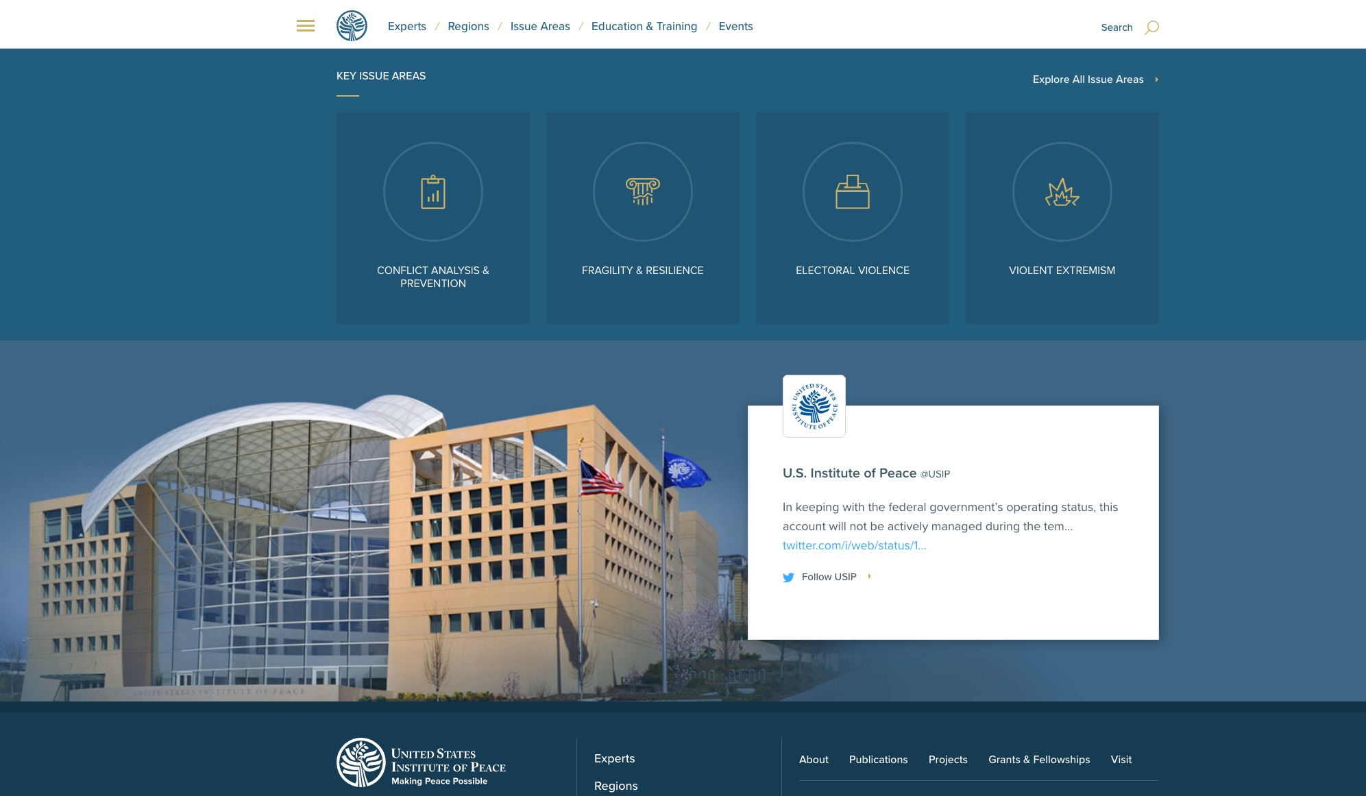
WDG worked with USIP to create an all-new content strategy, built on top of a powerful information architecture that ultimately allowed them to get more web traffic to their site, drive awareness of their work and resources, and increase the amount of time users spent on page.
3. Ease of Use is Critical
Today’s web users are used to seeing a seamless experience, and if you make it hard to engage, you might lose them. For-profit businesses and retail organizations have put tremendous effort into making their websites easy to use. Their goal is to make it not just easy, but fun. So, nonprofits need to keep up.
It is challenging to bring in attention and support at the same time. Many nonprofits have relied on WDG’s expertise to simplify and streamline their content strategy and develop an elegant information architecture to support all the things they need to share with their audiences—with the express intent of making their site fun and easy to use.
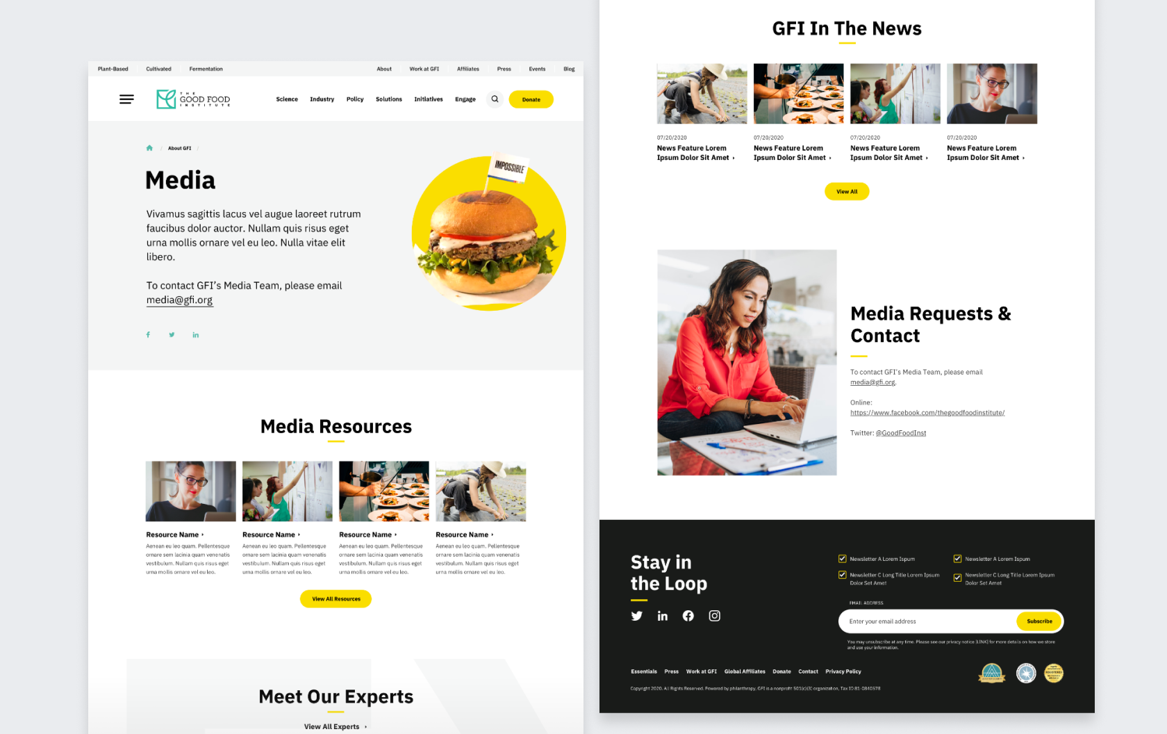
Look at the Good Food Institute’s site. They had such a fun and cool idea, but they didn’t have a website that could properly communicate it to their stakeholders.
They came to WDG for a site structure revamp and to work together on a rebrand. Together, we did a deep dive content audit and detailed strategic discovery to create an all-new site built on WordPress Gutenberg.
The rebranded site continues to be the ideal platform for sharing knowledge, solutions, and resources, as well as a place to start and grow partnerships for a more robust network of sustainable food enthusiasts.
4. Mobile is A Must
There’s no doubt about it—everyone is on the go all the time. You need to anticipate that users are just as likely to be using your site on a phone or tablet as a computer. You must meet people where they are.
This is especially true for nonprofits—your organizational mission is to serve your communities no matter where they are and engage with donors whenever and wherever the opportunity strikes.
Consider our work for the American Red Cross. The nature of their organization demands a mobile experience that can be easily utilized wherever and whenever disaster strikes. They came with a specific ask for their redesign: a responsive and adaptive site that catered to the unique needs of their audiences across any platform—laptop, desktop, mobile or tablet.
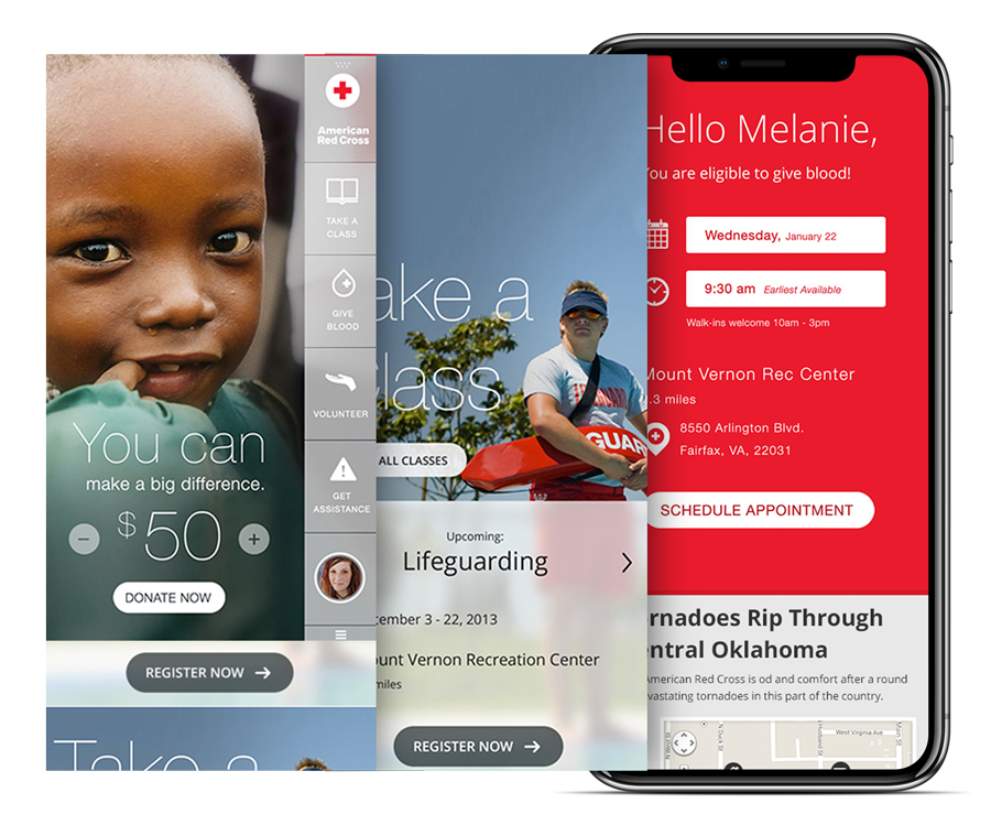
The solution was simple and elegant. Simplify audience interaction so they can get what they need in fewer clicks. This helped them to achieve their goal of a broad, growing, and distributed audience that uses their site for disaster relief services and info.
5. Provide A Clear Call To Action
The success of your website, and of your organization writ large, depends on engagement from donors and volunteers alike.
Your site needs to have a clear call to action. Calls to action should be strategically placed throughout your site to ensure that no opportunity is missed.
- Your site should make it easy and seamless to donate money or to volunteer time or resources.
- Contact information should be easy to find on every page.
- You also want to make it easy to capture email for future outreach and follow ups.
- Sometimes a gated asset like an ebook can encourage site users to share their contact information.
- You should also make sure to keep your site updated with the latest events to inspire donors and volunteers to participate in each new campaign you launch.
And of course, make sure your socials are visible and recognizable so site visitors can amplify your message and engage with your organization through different channels.
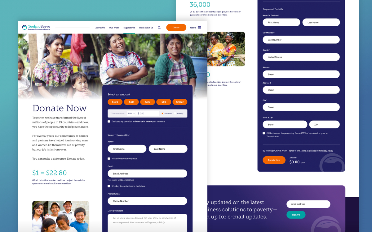
Our client Technoserve has a website that demonstrates this beautifully. They use meaningful imagery and storytelling that seamlessly guides the user to an easy opportunity to donate, as well as multiple opportunities to capture emails and nurture a long-term relationship.
6. Remember YOU Are Also The User
When designing a website, we often get so laser-focused on the user experience that we forget about what the upkeep will entail for the owner of the site. This will be your site to maintain as the editor or content manager.
In addition to a scalable architecture, one critical component will be choosing the right content management system. At WDG, we usually recommend WordPress or Drupal.
Both of these CMSs are among the most popular for nonprofits, NGOs, Fortune 100s, and government entities because they are user friendly, flexible, customizable, and mobile-responsive. Take a look at the various examples earlier in the article for a small sample of the vast capabilities of these two CMSs. Between the two options, there is everything you could want or need for a beautiful and engaging nonprofit website that both you and your users will enjoy.
The Last Word
If you suspect your site is not modern, easy to use, accessible, and totally mobile ready, you’re probably right. Contact our experts at WDG for a consultation to discuss how a new site can improve your content strategy and create a better space for engagement with your audiences.
For a better look at the examples of how WDG has partnered with nonprofit organizations to build out their online presence, check out these in-depth case studies:
- National Fish and Wildlife Foundation
- Good Food Institute
- US Institute of Peace
- American Red Cross
- Technoserve