A Components-First Approach to Web Design

In 2022, web experiences consists of more than color and typography choices for a page or two — the design phase now has more to do with critical thinking than color theory. And if you have a complex web experience/website with needs that extend beyond a few simple templates of a brochure site, you will need a robust collection of flexible components that allows a thoughtful design to come to life.
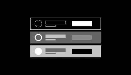
Components are the building blocks of a website. Your standard components include the navigation, the footer, the title/hero section of a page, et al. The difference between components and flexible components is that latter can be plugged in anywhere and on any page, such as sliders, accordions, CTAs, etc., whereas regular components are part of the template and cannot be edited in the CMS while you are crafting individual pages.
Why focus on flexible components?
Let’s say you’re part of a university website redesign. Their site can house anywhere from 20-40 frequently used flexible components that help build out everything from landing pages to event listings; course offerings to athletic calendars. This thorough collection of components has met the school’s digital needs as the site has grown, adding more capacity to meet any new demands.
When a university approaches a web agency, there needs to be a refresh of its existing system, not a total redoing. It is far more beneficial for the university’s site to enhance what it currently has than to start all over from scratch. WDG’s approach for handling such a complex system is to have our design team implement a Marie Kondo method of analyzing what works and what doesn’t — focusing on what brings the client joy and what needs to be cleared out.
By researching how and why the site administrator is trying to use each component, the design team can produce a more cohesive system. When we have components that function more thoughtfully, we craft better web pages and a better overall experience for the end-user.
The advantage of starting with components first
As evidenced by our university website example, certain projects will feature page content that’s well established and isn’t likely to change drastically during a redesign. And by knowing what content already exists on a page, we can focus more attention on which components are necessary to house said content. Do we need an accordion component? Or do we need a tab component that can house multiple accordions? A slider in the middle of the page?
Since the story of the page is already established, we can swoop in and sprinkle a few content-heavy focused components here, a few image-heavy components there. Our time is dedicated to designing the tools that can support the flow of your digital narrative.
It’s a group effort
Redesigning a website requires collaboration between teams — the client and the agency.
At WDG, our strategists and designers work together to create an exhaustive list of the existing components that are a part of our client’s website. From this list, we begin the process of collecting our client’s feedback about each component.
Any site administrator and/or page builder that will be implementing the revised components to the pages of the site needs to weigh in with their familiarity with the system that is currently in place:
- What components are broken?
- What components have been a pain to use in the back-end?
- What components need their functionality expanded upon?
The redesign of a system doesn’t end at front-facing, we need to also analyze and improve the experience of implementing components in the back-end.
Once we have a completed list of feedback, we move into wireframing and designing the components with our recommendations for improvement.
Finishing first
Function should inform the design process. Any designer can create a beautiful image slider for their clients, but once they understand such details as a client needing the ability to align the text in the slider to both the left and right, this drastically changes how the design should be approached.
The future of design is a more thoughtful one. When you have a suite of flexible components that fits your current needs, whether it’s ten or fifty, it’ll allow for infinite creative avenues when building out your pages and website.
