7 Rules of Typography

Websites are all about finding the most creative and aesthetic ways to showcase your brand’s value. Everyone is striving to be unique and to leave an impression on their viewer. When it comes to typographic design, however, the roles are slightly reversed. The aesthetic value suddenly becomes less important and functionality takes over. Instead of leaving an impression through fonts, colors, shapes etc., you should be leaving an impression through the content the typefaces are helping to portray. We’ve gathered some helpful rules to keep in mind while determining what typefaces will complement your site.
Rule #1: Moderation
The first rule of typography is to minimize the number of typefaces and fonts being used throughout your site. Getting carried away with various fonts and sizes is easy to do, especially when trying to distinguish pieces of information for your reader. Using too many typefaces can impact the load speed of a site, especially if you are pulling from various typography websites. Generally, use no more than two different typefaces on your site, and limit the number of font weights that you use. A site can quickly appear unprofessional when too many typefaces are being used.
Rule #2: Content Emphasis
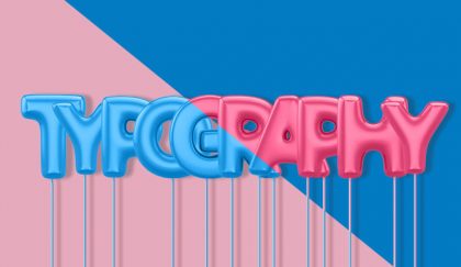
Although there are so many fonts to choose from, sticking to the basics may actually be your best option. By default, web-friendly serif and san serif fonts are easier to read and help readers absorb the information provided. Choosing exaggerated fonts may seem fun at the moment, but legibility is far more important when it comes to getting your users to successfully consume your content.
The purpose of your site is most likely to inform your readers about who you are and what it is you do, so keeping the focus on this valuable content is key. The only exception to dramatic typefaces on your site should be for branding purposes. If these dramatic typefaces are used they should not be used on large body copy, limit it to headings or small bits of text.

Rule #3: Legibility of Typefaces
Content should be legible on all screen sizes. It can be very easy to get carried away adjusting letter spacing, line spacing, and font height while building your site on your desktop. Choosing dramatic typefaces can become challenging when your viewers begin to visit your site on mobile devices. Distinguishing between different letters when using dramatic type on small screens can become difficult. It should be easy to distinguish between letters with similar shapes, like the letters “L” and “I”. Depending on the font these letters can occasionally become undifferentiable. So remember to test your fonts and ensure they are legible in all situations.
Rule #4: Defining Typefaces
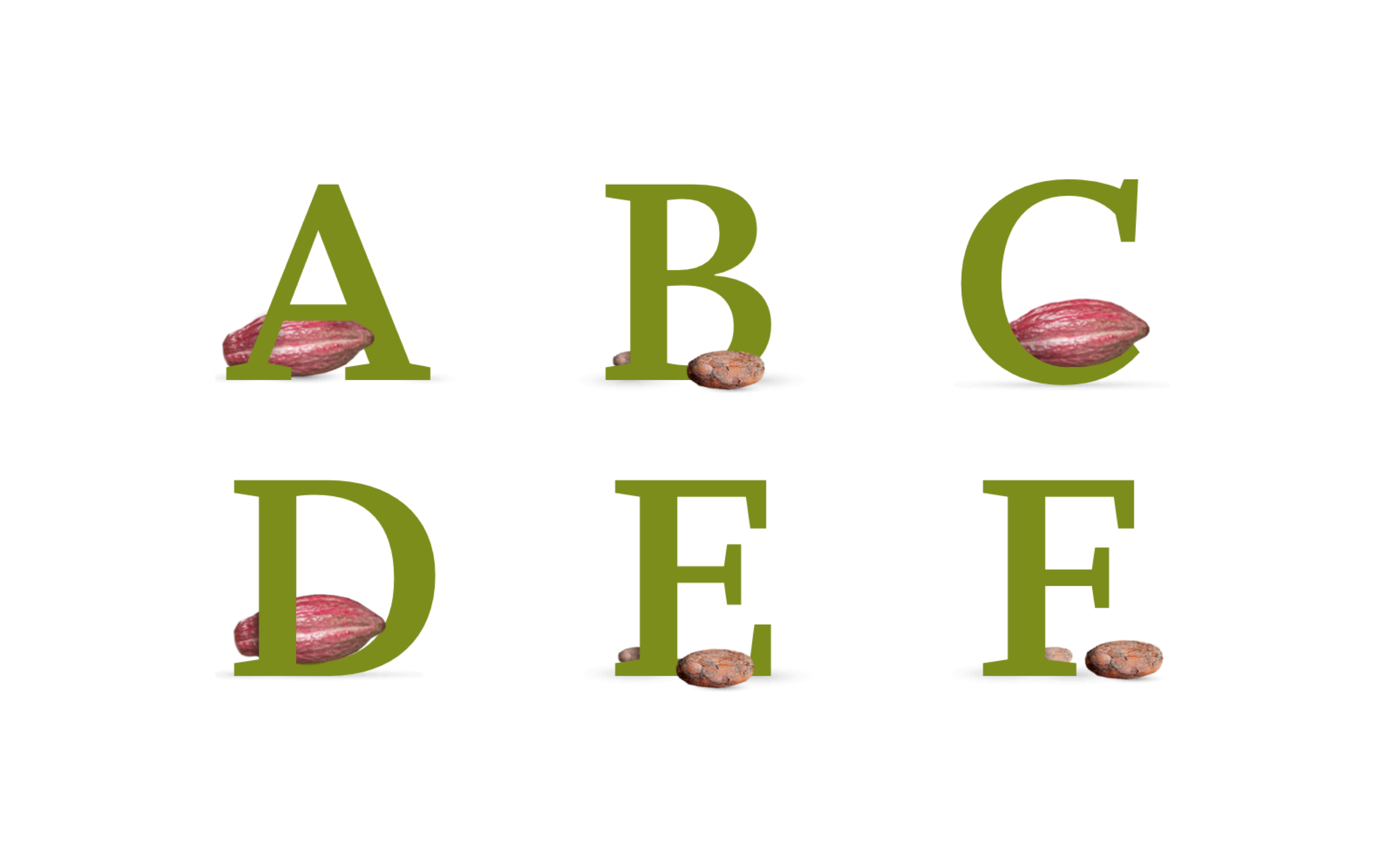
Ensure the style of typefaces you choose complement the content they are relaying and align with your brand. Typography can portray many different attitudes. Typefaces can be playful, bold, professional, elegant, etc. Disconnecting the readers from the content by choosing a playful type with serious content will only cause confusion. San serifs types lend themselves to a modern clean look. Handwritten types add a personal touch. Serif fonts are good all-around and ideal in terms of legibility. The options are endless so be sure to spend time picking the one that fits your brand perfectly.
Rule #5: Mixed Cases
Use mixed case typefaces. Capitalizations should only be used when necessary. Types that contain all capital letters greatly decrease legibility. All capital sentences are difficult to read no matter what size they are and decrease comprehension.
Rule #6: Color Representation
Colors are another important component to keep in mind while finalizing designs. Color blindness is a common problem and in order for your site to be 508 compliant, you must adjust accordingly. There should be enough color contrast between the letters and the background. Color blindness is most common with red tones and green tones so it is important to pay special attention to these colors and ensure that all viewers can easily read your site. Be sure to avoid using light greys and pale colors for text as they are difficult to read.
Using color to complement your content can be beneficial and bring attention to particular words or phrases that you want to stand out. Keep in mind that colored content may look like a link, but it stands out from the rest of the content.
Rule #7: Budget Considerations
Your budget plays an important role in your typography decisions. Google fonts provide free typefaces to choose from and offer an affordable solution. Using sources like fonts.com, Adobe Fonts, and custom designs, can provide you with a unique appearance but it will also be an investment. It is important to ask yourself how much you are willing to spend and base your decisions off that.


There are so many more details that we could get into but hopefully, these 7 rules will help to get you started with a basic understanding of typography. Get in touch if you’d like to speak with our designers and discuss your design project!
