How Color Affects Website Valuation


How Color Affects Website Valuation
There is more to color than what meets the eye. There is a whole branch of behavioral psychology that is dedicated to the study of how color affects human behavior. So when it comes to designing a website, color palette, color placement, button color, link color and use of white space takes on much more of a significance than simply creating something that is visually pleasing. Our visual sense is the strongest, as well as the most developed, so it’s not surprising that we weigh color so highly when assessing a site, even if done subconsciously. Research from QuickSprout designates that 90% of all product assessment is attributed to color, with color specified as 85% of the reason someone might purchase a product. And in the journal article, Impact of Color on Marketing by Satyendra Singh, it is determined that it takes a brief 90 seconds for a site viewer to form an opinion, with 62-90% of that interpretation being determined by the color scheme utilized. Those are some pretty big numbers, so when color is such a contributing factor to not only brand valuation, but conversion rate as well, It’s a no-brainer that ROYGBIV be taken quite seriously.
Designing Websites for Color Theory
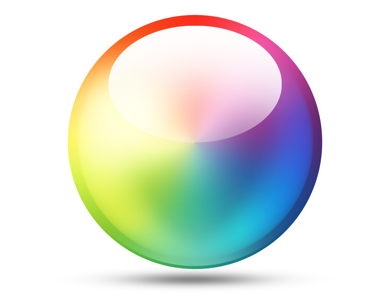
At The Web Development Group, our team of designers are experts in color pairing, balance, shading and tinting, and know just how to offset the bright with the neutral, and compliment the bold with the basic. According to WDG designer Kristina, “Complementary, analogous, and triad colors are your best bet. With that said, don’t use all the colors on the wheel. I usually stick with a maximum of 3 different colors, and you can have as many shades, tints, and tones of 1 color as you’d like.”.
Every aspect of design is tested, for the best distribution of a chosen color scheme amongst headlines, buttons, links and accents. For instance, it has been found that the highest converting color choices for a call to action are eye-catching, primary and secondary colors, like red, yellow, orange and green, while the lowest converting colors are darker or more neutral ones, like black, grey or brown. There are also nuances to take into account, like the target audience, and how women vs. men or seniors vs. youth respond to color. There are certain colors, such as purple, that women respond positively to, but men negatively to. And likewise, if your site has a senior target audience, contrasting colors and lots of white space should be utilized for easier viewing. So if we haven’t stressed it enough already, color selection must be approached strategically and scientifically for successful design.
Luckily, extensive research has determined the various affects and feelings that different colors conjure in the human mind, and here at WDG, we have created attractive and research-based color palettes around those emotions, for effective, compelling and beautiful sites!
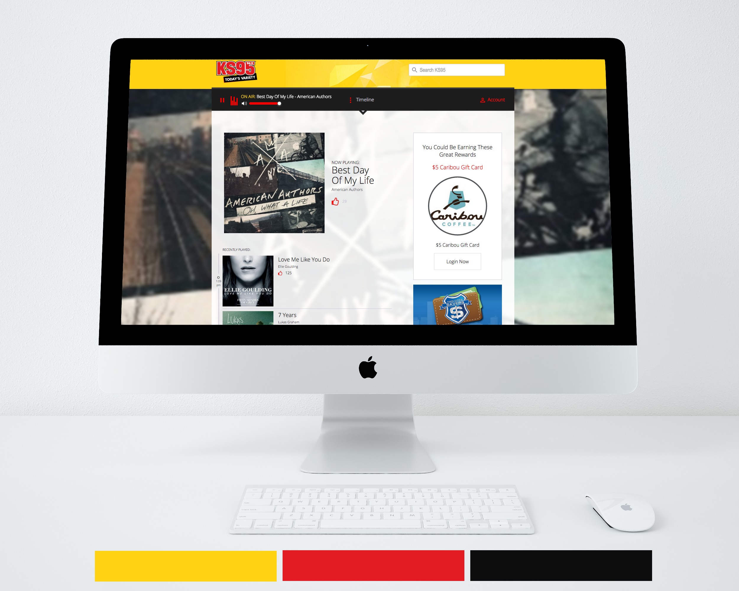
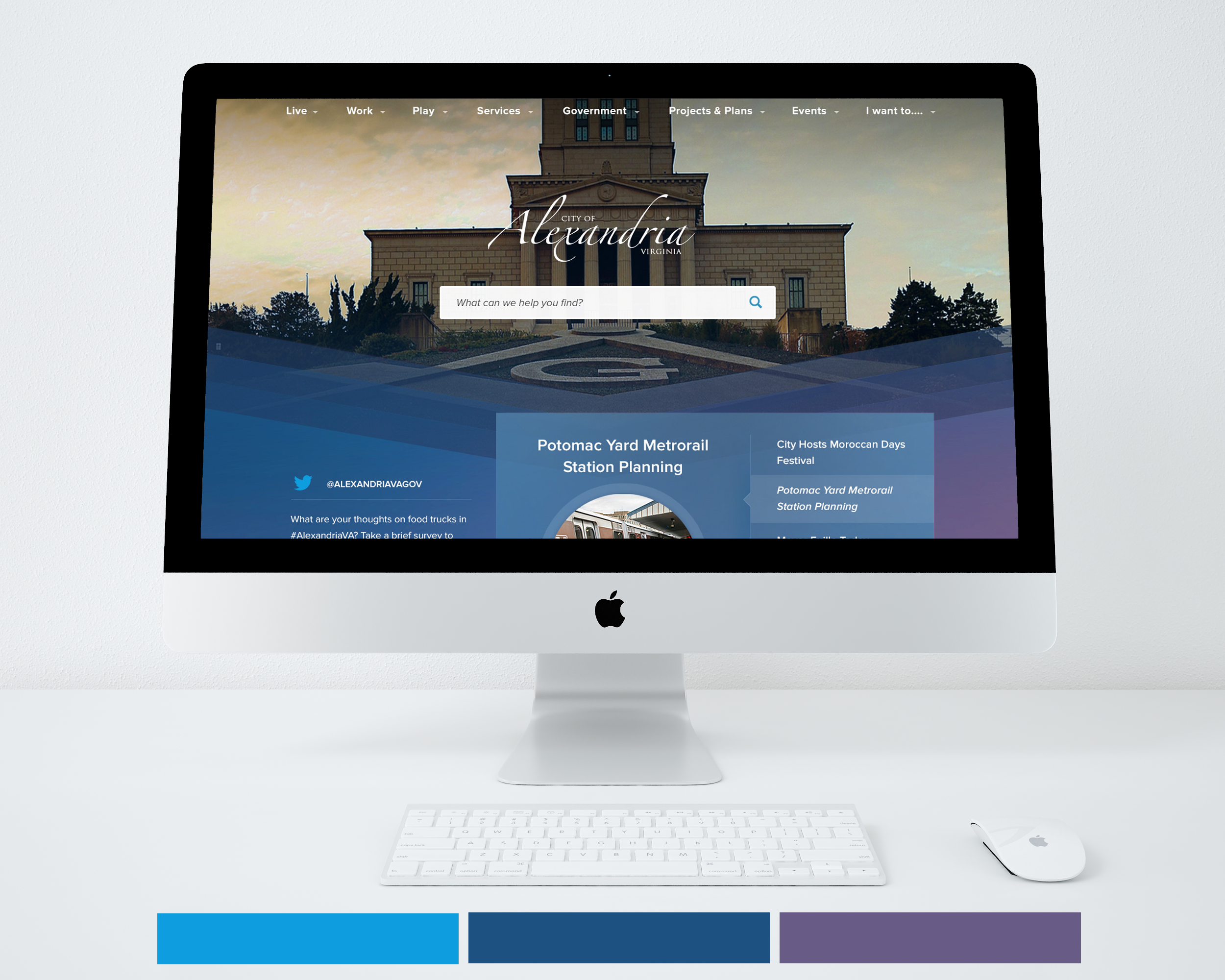
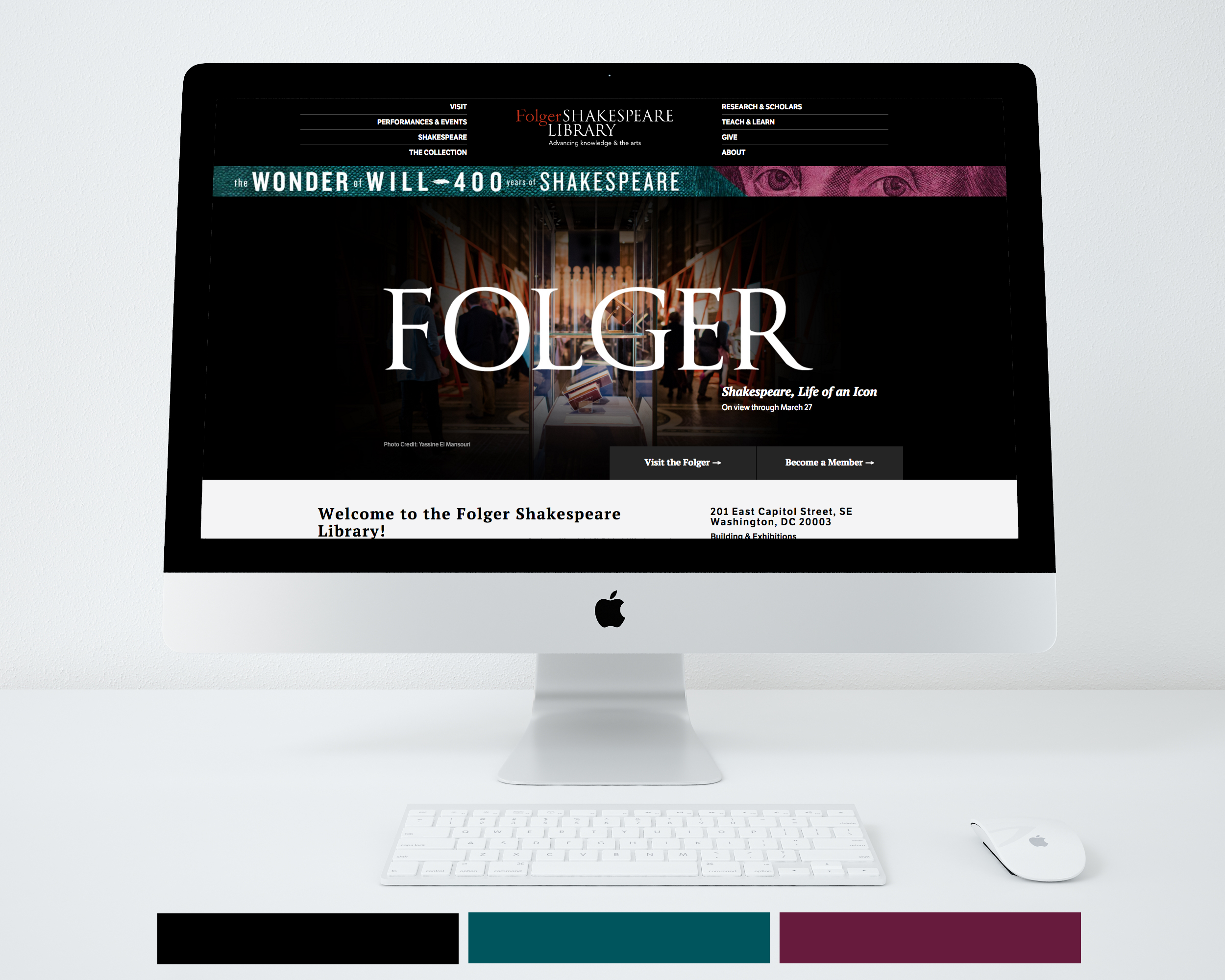
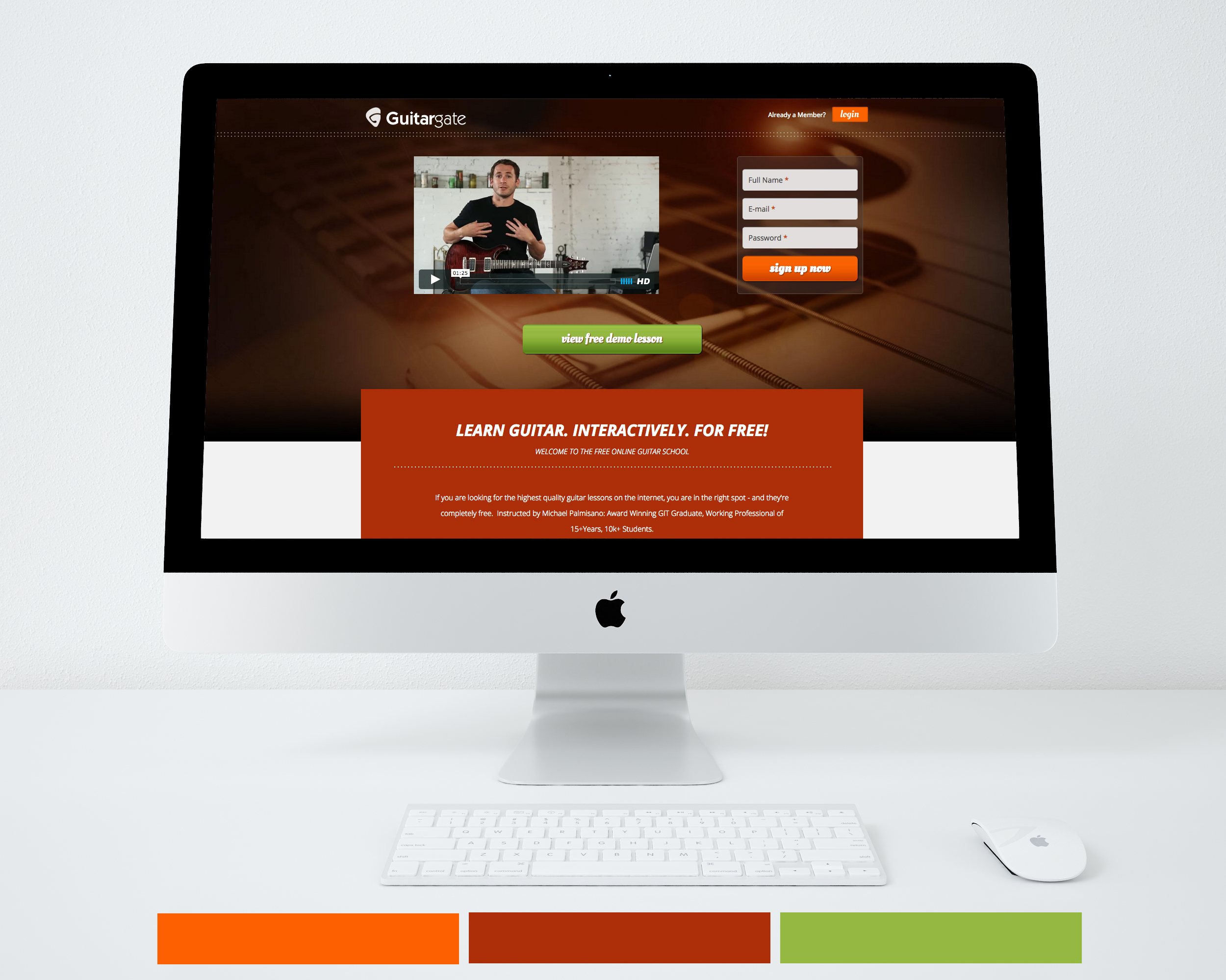
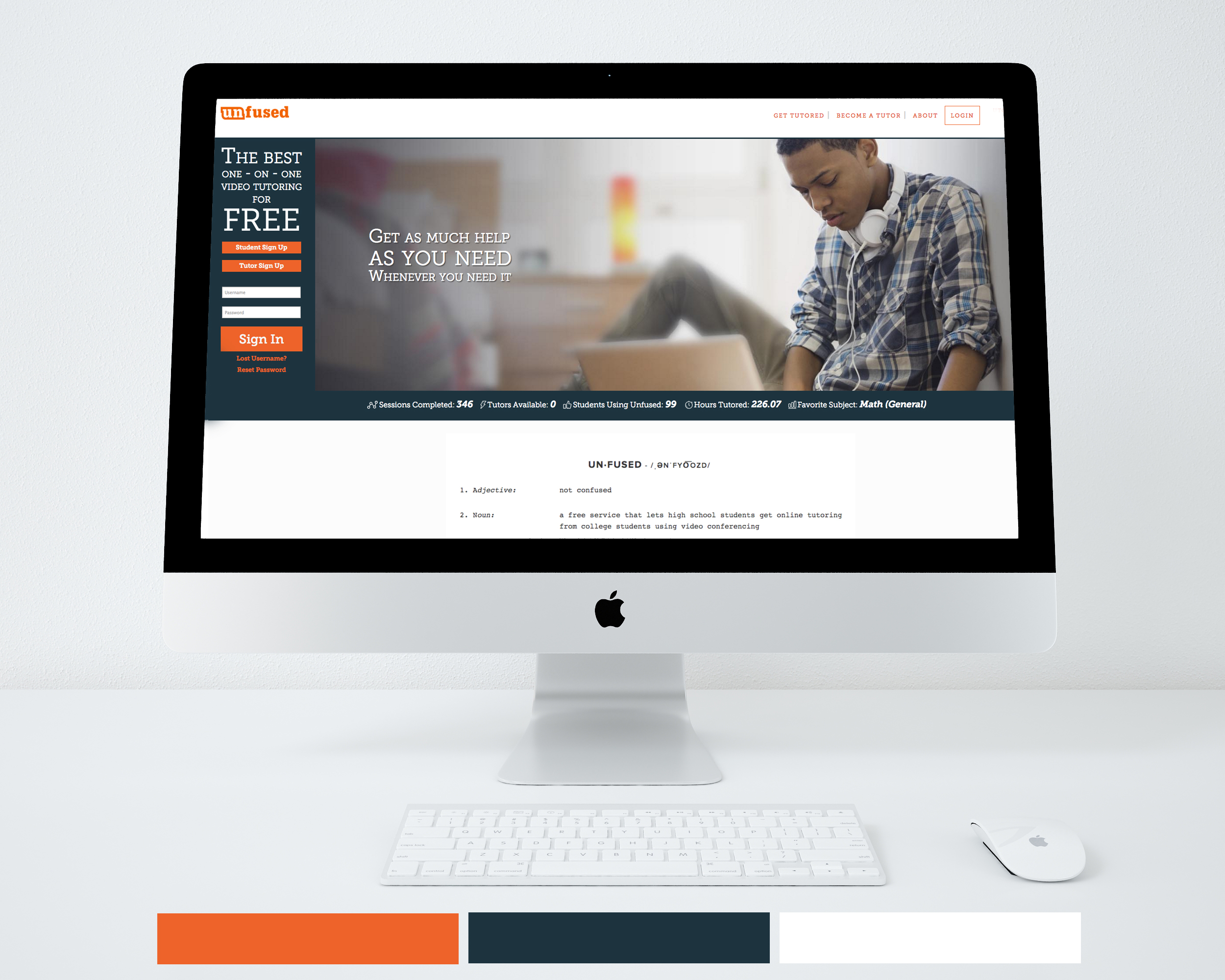
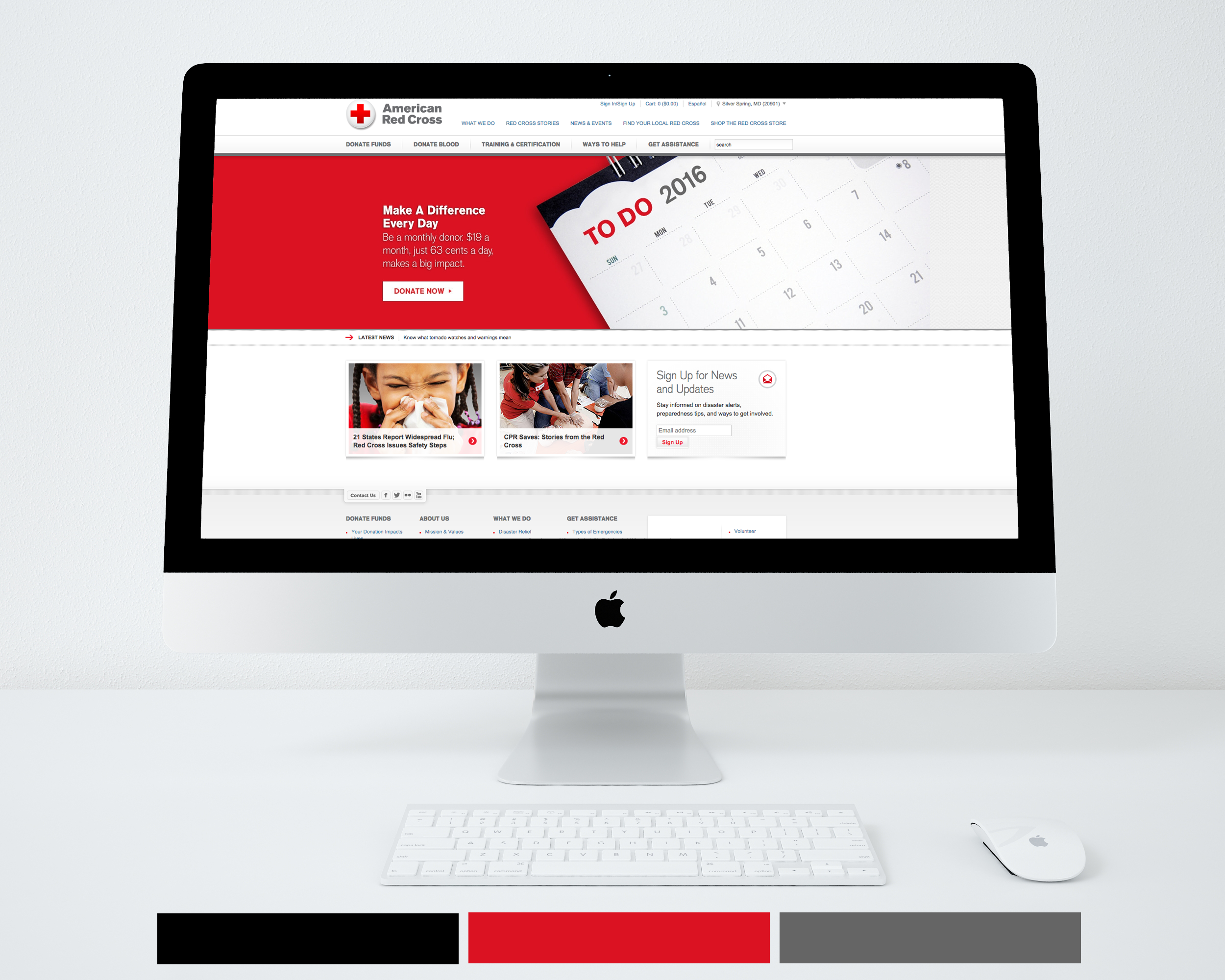
Examples of Successful WDG Sites that Utilize Color Theory
Blue. Use blue as a prominent color if you want your brand to convey Trust, Authority or Relaxation.
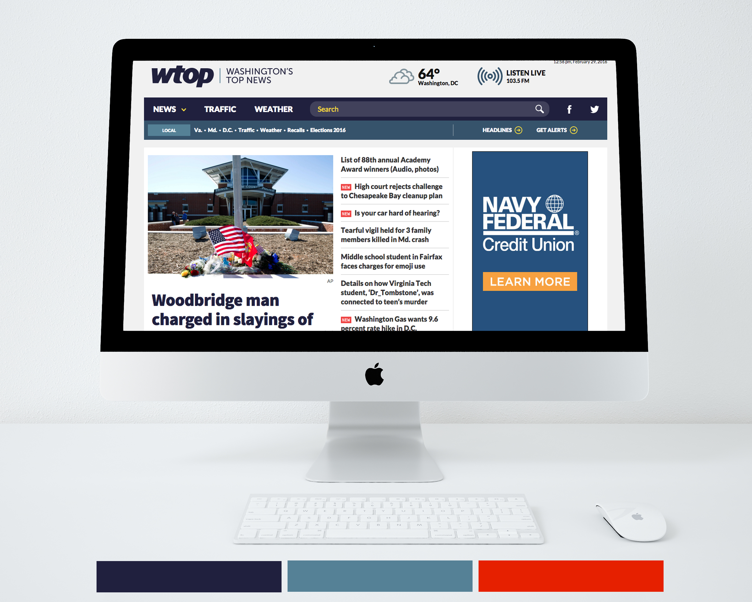

Black. Use black as a feature color if you want your brand to show Luxury, Power or Sophistication.
Orange. Highlight orange if you want your site to portray Fun, Youth or Incitement.
Red. Utilize the color red if your goal is to make your site characterize Urgency or Alertness.

Yellow. Feature yellow if your site will depict Friendliness or Excitement.