What Video Games Teach About Design: Prototyping is a Must
When building complex interactions, planning, testing, and iterating is crucial for great user experiences. Before jumping headfirst into your project, you have to test your ideas over and over to ensure what you’ve created is the most effective means of accomplishing your user’s goals.
Strategically determining how information should be laid out for a user is the most important thing when it comes to designing for the web. You have to understand what they want conceptually—what approach will you take to best meet the client’s and user’s requirements. And you also have to understand in practical terms what is actually needed, instead of over-delivering features the client doesn’t need.
Methods that go into building websites and mobile apps also have parallels in video games, especially with interface and input decisions.
Prototyping and Video Games: The Last of Us

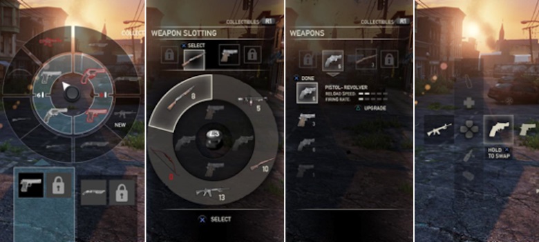
Let’s use an example from 240-time Game of the Year Award winner, The Last of Us, a post-apocalyptic survival-horror game, and the weapon-slotting/upgrading system created by UI designer Alexandria Neonakis.
The initial task? Create a system allowing users to switch and update their weapon choices in real-time. Much like web design tasks, Neonakis began with wireframes. But instead of using wireframes to guide visual implementation, she focused on emotion:
“When I designed the wireframes, I didn’t bother focusing on how things would look. Instead, I focused on how it would feel and function. If you can get something to feel right, then you can dress it up however you want later.”
While testing and iterating, Neonakis considered how the system fit within the atmosphere of the game. At first, weapon switching required players be stationary as the character rummaged through a bag for the item, but as Neonakis explained:
“It was frustrating to play and rarely felt smooth. It often felt awkward and really clunky (again). It didn’t actually feel believable at all. The amount of frustration you got from this system outweighed any real life believability it may have given the story.”
Here, Neonakis is focusing on how the interaction feels and not how it looks. After testing different concepts, her final solution was to separate the upgrading and slotting systems from each other. The bigger point is that sometimes, when a solution isn’t obvious, you have to iterate and iterate until something sticks.
Also it’s definitely tedious, putting in the extra work and attention to detail at the beginning of the redesign process really helps keep things moving forward. At WDG, my favorite prototyping tool is InVisionApp. This free website and mobile prototyping tool is great for collaborating internally and externally with clients about different design iterations. Want to learn more? I’ve previously raved about InVision App.
Interested in getting a website project started?
You’re in the right place—contact us today! Don’t forget to tweet us and check out our Facebook page!