What Google’s Mobile-Friendly Ranking Means For You


Gone are the days of designing just for desktop. With 58% of Americans owning a smartphone and 42% owning a tablet, ensuring your website is as usable as possible is crucial.
Especially now that Google has big news to share!
Starting April 21st, mobile-friendliness and responsiveness is going to be a new ranking factor in Google’s search engine results.
Mobile-Friendly: What You Should Know
And just when you think you’ve caught up with all the latest digital trends, Google’s thrown another curveball.
In a nutshell, Google’s new release means that mobile-friendly, responsive websites will be ranked higher than websites that aren’t responsive, thanks to their new search algorithm. Leave it to Google Webmasters to explain:
“…we will be expanding our use of mobile-friendliness as a ranking signal. This change will affect mobile searches in all languages worldwide and will have a significant impact in our search results. Consequently, users will find it easier to get relevant, high-quality search results that are optimized for their devices.”
“Okay, but now what?” Don’t worry, we’re getting there!
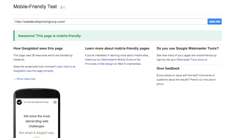
Google Developers Mobile-Friendly Test
Google Developers Mobile-Friendly Test—part of the larger Google Mobile Guide—is a ridiculously straightforward tool for analyzing a particular URL and determining whether or not it is mobile-friendly. All you have to do is enter your URL, and the Mobile-Friendly test will do the rest.
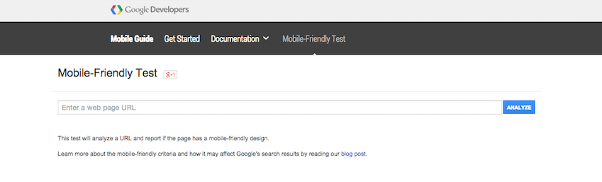
What you get will look something like this:
Why is Mobile-Friendly Important?
Although Google’s mobile-friendly update won’t impact your desktop rankings (for now), it doesn’t mean there won’t be any consequences.
Take the all-important user experience, for example.
Say you’ve searched on your smartphone for movie reviews of the latest blockbuster. Picking the first link that appears on the results, you find yourself looking at microscopic text and content that’s only visible when your scroll sideways.
Ouch, am I right?
Focusing on the mobile experience ensures your users have an intuitive experience devoid of cluttered and unhelpful content. Instead of overpacking your website “suitcase,” mobile-friendly sites prioritize functionality over fluff. Anything that you don’t really, really need for your figurative website vacation, toss out and save real estate. Your users will thank you later.
So, What Can You Do?
First thing’s first: check your page with the Mobile-Friendly Test. Google judges a page on a few criteria, like whether or not:
- the page sizes content to the screen,
- the page places links with enough space to be easily tapped,
- or the page uses text that is readable without needing to zoom.
If you pass, you’re already on the right path. Didn’t pass? No fear.
One thing you can do is commit yourself to some website-DIY. Google has provided a thorough article of all the steps you should take to make your website responsive. But this can be a tedious process, especially if you’re not sure where to start.
So, the second thing you can do is employ the help of expert designers, strategists, and developers—just like the ones at WDG. Combining best practices and years of experience, crafting a functional and responsive website to improve accessibility for your users is our speciality.
Want to make the shift to a responsive website? Get in touch today!
Other Resources
Are you a designer? Be sure to check out this article on designing for mobile-friendliness.
Want to learn more about how Google’s update will affect you? Here’s a complete list of 9 questions you need answers to, brought to you by Moz.