As far as I know, there aren’t any big secrets that I can divulge to make you a better designer – this comes from years of practice to refine your craft. What I can provide is tips on how to get to that point of awesomeness by enhancing your efficiency in all aspects of your web design work. Every second you can shave off in any aspect of what you do will allow for more time in design.
This list is all about saving you time so you can allocate that much more effort in to designing spectacular websites.
Hardware
Second Monitor
I went through all of college on my 17” MacBook Pro. I picked such a large model because screen real-estate is so important for design. My screen is a cacophony of tabs, finder windows, emails, and a large Photoshop window. Getting a second monitor was an obvious benefit to my process. Less scrolling, less tabbing between programs, and being able to keep everything important on one monitor and secondary on the second monitor means I spend a lot less time having to check or reference something and more time designing.
A Mouse with 360˚ Scrolling
The hand tool is overrated, and I know you hate it. Why drag your way across the canvas and slide your way left and right, when you could do it quickly and fluidly with the hand that’s already doing everything else? Get any mouse with a scrolling ball if you’re going to be in design software for a long time. If you can afford to, consider the newest
Apple Magic Mouse – I have extremely positive feelings about it.
Shell Out for the Solid State
Is your computer feeling a little sluggish and starting to show signs of age? Assuming your machine was ever a competent working computer, it can still probably be salvaged by upgrading certain components that’ll make it feel as good as new.
My 2009 MacBook Pro had been starting to feel run down while trying to keep up with the latest hardware and software updates, this being nearly four years after purchasing it. I learned at my last job that I could: gut my CD-drive, replace it with a solid state drive, load system files and regularly used applications on to the SSD, use the old hard drive for regular files, and boom—completely reinvigorated machine!
The amount of speed increase I felt in every aspect of my computer is beyond compare. Everything is lightning fast. My Adobe programs responded faster, letting me speed along through designs without having to wait for tools to initialize. It’s great, and I highly recommend it.
Assets / Research
Research / Inspiration
You’re as good as the content you immerse yourself in. Make sure it’s always great! I try to constantly discover and bookmark effective solutions and well-realized designs from Behance,
Dribbble, and my favorite agencies. It’s important to always have a handy collection of reference for layout and problem-solving. How did this person’s design meet its goal, how were they able to compound several complex elements into a rhythm that works for the page as a whole: these are important questions to ask.
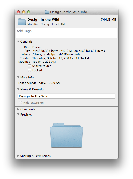
Whenever I see a web page that I think has a particularly exceptional feature, I use an OSX app, PageLayers (
http://www.pagelayers.com/ ) to grab a screenshot and catalog it into a my “Design in the Wild” folder. It works great, and is extremely useful for obtaining full-page screenshots of both desktop and responsive breakdowns of a site.

Image Resources
Many clients come to us with little to no image resources, so it helps to be able to fill the gaps to add to the believability of what you’re presenting. Sites like Compfight and The Noun Project have been indispensable tools for me, providing royalty-free images and icons that give designs a much more real-world execution than flooding it with images of cilantro as a placeholder.
Organized Font Libraries
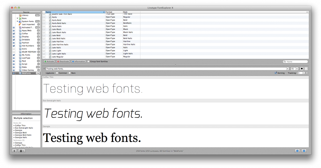
I definitely have a lot less room to pick and choose wild, funky fonts since making the switch from print to web; however, it’s still important for me to quickly know what I can and cannot use on the web. Any font manager you’re using should have the ability to make custom collections – keeping it up to date will save you some time from having to go back to google’s web fonts library or
fonts.com rediscovering what you can and cannot do every time you begin a project.

While Designing
Draw First, Then Pull the Trigger
A practice I heard first from master art director Owen Shifflet (
http://www.owenshifflett.com/ ), you should always know what you’re going to do before you attempt to do it. Take the time to pause, sketch, and compose your thoughts before you jump onto the computer. Paper planning works great because you’re much more prone to erase and reset your thinking– when you work on the computer, you’ll spend more time working on the idea that actually isn’t working. Spare yourself the trouble of designing yourself in circles.
Considering for Responsive
For each stage of any project I design at WDG, the most frequent question asked by folks looking at my work is “how is this going to break down on different screen sizes?” Always have an answer and always assume people will use that cool desktop site you made on their skinny, mini phones. When designing, you should always keep in mind what will happen as you condense an experience built for a desktop into the palm of your hand.
The goal of responsive design is never to remove content from a site, but, instead, to trim it down so the user can still access the same content as they would be able to on the desktop site. Make sure it’s always on your mind!
PSD Organization
It’s easy to get into a steady rhythm in Photoshop and being so focused on the complete picture that you forget to organize the layer components into something navigable. Take that extra second to name your layers, group them in a reasonable way, and order them in a way that makes sense (preferably the same way people read: top to bottom and left to right). This will help you edit your file with more ease, and will make exporting the assets for development a breeze.
Collaboration / Check-ins / Feasibility
Ask your follow designers, ask your developers – try to avoid designing in a vacuum away from everyone else. If you aren’t a coder, you might want to check in with developers to make sure that wild interaction you want is within scope; likewise you should ask your fellow designers if everything is looking as sharp as it seems in your head. Bouncing ideas off one another throughout the design process only serves to make the final deliverable all the more refined.
Hopefully, my list of tips will help speed up your workflow and inspire you to become a better, more efficient web designer. Do you have a favorite design tool or tip that I didn’t mention? Share with us on Twitter at @wdgtweet!


